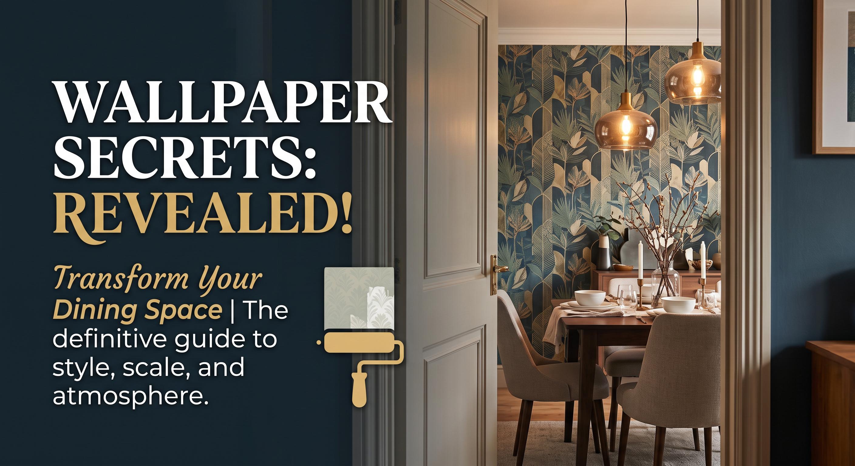
A dining room has a different job than the rest of the house. It needs to feel welcoming for Tuesday-night takeout, polished enough for a holiday table, and personal enough that it does not resemble a forgotten formal room. The best wallpaper for dining rooms creates that atmosphere quickly, turning the walls into part of the gathering instead of a blank backdrop behind the chairs.Wallpaper is especially effective here because dining spaces often have clear sightlines and relatively little soft furniture. A well-chosen pattern can add warmth, depth, and character where paint alone may feel flat. The right choice depends on the room’s light, size, table shape, and how boldly you want the space to speak.
Start With the Mood You Want to Set
Before narrowing down colors or prints, decide how you want people to feel when they sit down. A dining room does not need to be formal to feel special. It can be calm and collected, lively and conversational, richly layered, or lighthearted and bright.For a relaxed, nature-inspired room, botanical wallpaper with leafy forms, garden florals, or soft branches gives the space an easy sense of warmth. Muted greens, dusty blue, warm ivory, and faded terracotta work beautifully with wood tables, woven shades, linen napkins, and vintage-style lighting.If you prefer a more tailored look, consider a geometric, Art Deco-inspired, or luxury-inspired pattern. Repeating arches, fine linework, marble-like movement, and metallic-look details can bring structure to a dining room without requiring ornate furniture. These patterns suit black accents, sculptural pendant lights, upholstered chairs, and a more edited tabletop.For households that use the dining room every day, do not underestimate playful color. A fruit-and-floral print, painterly abstract, or colorful block pattern can make ordinary meals feel more intentional. The key is choosing a design you will still enjoy after the centerpiece and dishes are cleared away.
Choose the Best Wallpaper for Dining Rooms by Scale
Pattern scale affects how the room reads from the doorway and from the table. It is one of the biggest differences between wallpaper that feels thoughtfully chosen and wallpaper that feels unexpectedly busy.
Small dining rooms can handle a statement
A common instinct is to choose a tiny pattern for a compact dining room. Sometimes that works, but a large-scale mural or open, oversized botanical can make a small room feel more expansive. Broad leaves, oversized flowers, soft clouds, or a painterly landscape create visual depth because the eye travels through the design rather than stopping at many small repeated shapes.The most important detail is breathing room. A large print with a light or mid-tone background often feels less crowded than a dense, small-scale pattern with high contrast. If the room has low ceilings, designs with upward movement, such as climbing vines or subtle vertical lines, can also make the walls feel taller.
Open dining areas need definition
In an open-concept home, wallpaper can visually separate the dining area from the kitchen or living room without adding a wall. This is an ideal setting for a feature wall behind a sideboard, banquette, or dining table. A mural-like city scene, abstract landscape, or bold floral can establish a distinct dining zone while keeping the floor plan open.For a full-room installation, choose a print that relates to nearby spaces instead of competing with them. If the kitchen has strong veining in the counters or a patterned backsplash, a softer wallpaper with fewer colors may be the better partner. If the surrounding rooms are neutral, the dining area can carry more pattern and personality.
Traditional dining rooms benefit from balanced repetition
In a separate dining room with crown molding, chair rails, or built-in cabinetry, classic repeat patterns feel especially at home. Damask-inspired motifs, delicate florals, toile-style scenes, and refined stripes can highlight architectural details rather than overwhelm them. Keep the scale proportional to the wall sections between doors, windows, and trim.
Let Color Work With Your Table, Not Against It
Wallpaper color is not just about matching dining chairs. It should support the materials that stay in the room year-round: the table, flooring, light fixture, window treatments, and cabinetry. A dark walnut table looks especially rich against softened greens, pale clay tones, blue-gray florals, and warm neutrals. A light oak or white table can handle deeper navy, charcoal, emerald, or burgundy walls for contrast.Consider the light at the time you use the room most. North-facing spaces can make cool wallpaper colors appear grayer, while strong afternoon sun can intensify warm yellow, peach, and terracotta notes. Ordering a sample gives you the chance to see the actual color against your furnishings in morning, afternoon, and evening light.You also do not need to match every color exactly. In fact, a room usually looks more collected when the wallpaper picks up one or two tones from the furniture rather than copying them all. A print with a hint of the chair fabric color or a shade that echoes the rug is enough to make the design feel connected.
Think About Everyday Dining Room Reality
Beautiful walls still need to make sense for the way you live. If children, pets, frequent guests, or serving dishes are part of the picture, place wallpaper where it can be appreciated without bearing the brunt of daily wear. A wall behind a buffet, a bank of chairs, or a built-in banquette is often more protected than the wall nearest the busiest kitchen path.Peel-and-stick wallpaper makes a high-impact update more approachable for homeowners and renters who do not want the mess or commitment of pasted wallpaper. It is designed for DIY application on smooth, clean, properly prepared walls, and custom sizing helps reduce the guesswork of ordering standard rolls. Still, it is not a shortcut around surface preparation. Textured walls, fresh paint that has not fully cured, peeling paint, or dusty surfaces can affect adhesion.For a polished result, measure each wall at its widest and tallest points, accounting for trim, corners, and any areas that require extra material for pattern matching. Made-to-order wallcovering is typically produced to your dimensions, so confirming measurements before ordering matters. Because custom products are generally non-returnable once made, samples are the smart first step when you are deciding between colors, materials, or a full-room installation and an accent wall.
Match the Pattern to the Dining Room’s Focal Point
A dining room looks most cohesive when the wallpaper and focal point support each other. If your chandelier is dramatic, choose a wallpaper that frames it rather than fights it. A quieter stripe, textured abstract, or small botanical can let a statement fixture lead.If the table is simple, wallpaper can take center stage. An expansive floral, moody jungle scene, celestial motif, or mural-style landscape gives the room its signature moment. In this case, keep the rest of the room edited. Simple drapery, neutral dishes, and a restrained centerpiece let the walls do their work.For rooms with a sideboard or bar cabinet, use that wall as a natural anchor. The wallpaper becomes a backdrop for lamps, artwork, glassware, and seasonal styling. A personalized mural can also make sense in a dining area used for hosting, especially in a vacation rental or home where the space is meant to feel memorable rather than generic.WallpaperCraftWorks designs are made to order, which gives you more freedom to choose a wall treatment that fits your particular wall dimensions instead of trying to force a room into off-the-shelf roll sizes. That flexibility is especially useful around dining room trim, built-ins, and accent walls that are not standard widths.
Avoid the Choices That Create Regret
The strongest dining room wallpaper is not always the boldest option. A pattern may look exciting on a screen but feel tiring if every square inch is high contrast, tightly packed, and brightly colored. When you are drawn to an energetic print, consider using it on one focal wall and painting the remaining walls in a coordinating shade.Another common mistake is ignoring the visual weight of furniture. A dark, oversized table with heavy chairs can feel grounded by a lighter, more open wallpaper. Delicate bistro chairs or a glass table may need a bolder print behind them so the room does not disappear.Finally, do not skip the sample simply because you are confident about the design. A sample lets you assess scale, finish, color variation, and how the adhesive material feels in your own space. Tape it near the table, view it from the entry, and look at it during dinner with the lights on. That small step can turn a good choice into one you feel genuinely excited to install.Choose the wallpaper that makes you want to set the table, even when the meal is simple. The most memorable dining rooms are not built around perfection. They are built around a mood people want to return to.