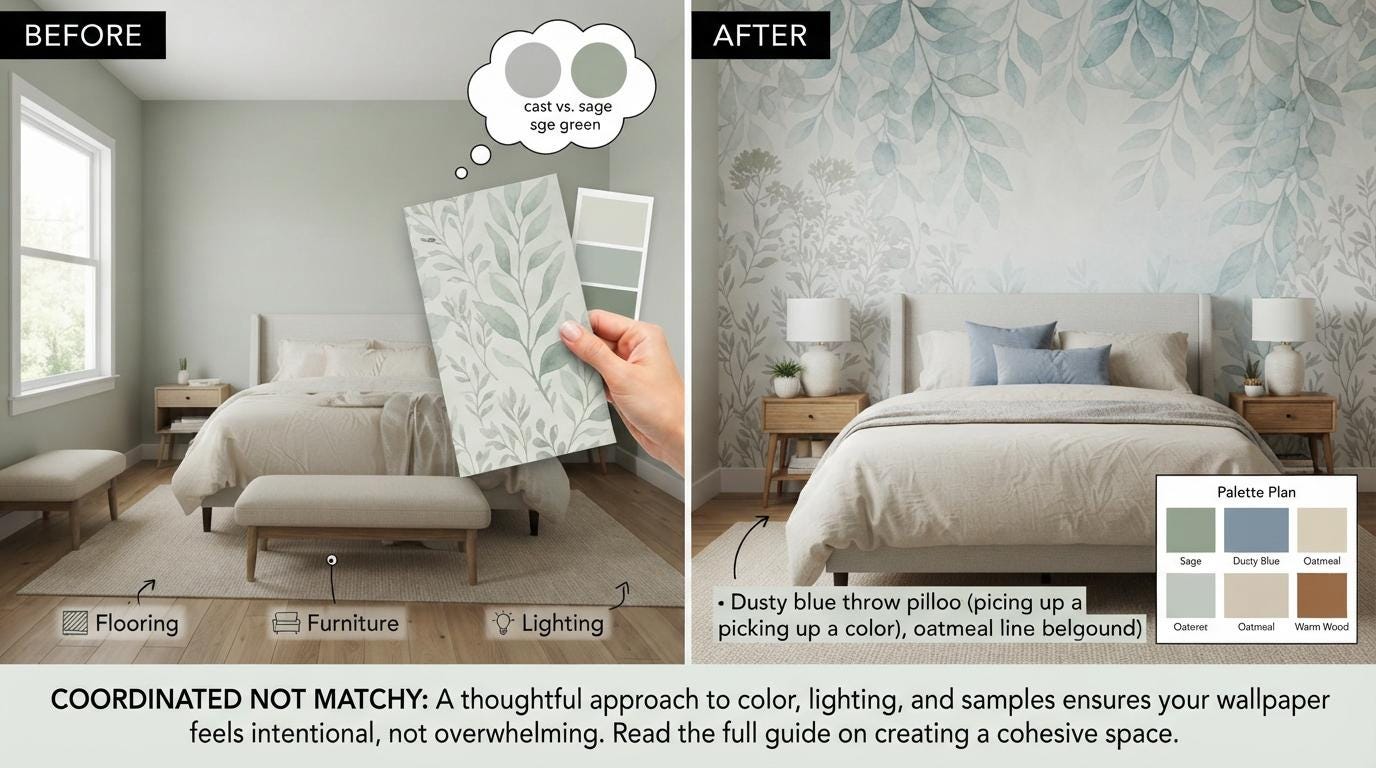
A wallpaper sample can look like a soft sage in your hand, then read almost gray once it reaches a north-facing bedroom wall. That small shift is why wallpaper color matching is less about finding an exact match and more about creating a room where every color belongs. When the wall, paint, furnishings, and lighting agree on a mood, even a bold botanical or dramatic mural feels intentional rather than overwhelming.Peel-and-stick wallpaper makes it easier to take a style risk, but it still pays to plan the palette before ordering a custom-size design. A few smart checks can help you choose colors with confidence, whether you are refreshing a rental entryway, creating a polished nursery, or giving a home office a more finished point of view.
Start With the Colors You Cannot Change
Before choosing wallpaper, look around for the room's fixed elements. Flooring, cabinetry, countertops, tile, a fireplace surround, and major upholstered furniture already set color boundaries. They do not all need to match the wallpaper, but they should not compete with it.Warm oak floors often work beautifully with cream, olive, terracotta, muted blush, and golden botanical tones. Cool gray flooring can support misty blue, charcoal, lavender, and crisp black-and-white patterns. If your room has mixed finishes, such as warm wood with cooler gray stone, look for wallpaper that includes a bridge color. A floral print with warm beige leaves and slate blue blooms can connect both sides of the room without forcing either finish to change.Large furniture matters just as much. In a living room with a camel leather sofa, a wallpaper with warm neutrals or aged-gold accents will usually feel more cohesive than a stark icy gray. In a child's room, begin with the largest visual pieces too: the rug, crib, bedding, or painted dresser. Let the wallpaper bring personality, then repeat one or two of its quieter colors in the rest of the space.
Wallpaper Color Matching Begins With Undertones
Two whites can look completely different beside one another. One may lean creamy or yellow, while another carries a hint of gray, blue, pink, or green. The same is true for beige, gray, navy, and even black. This underlying cast is the undertone, and it is often the reason a pairing feels subtly off.Hold a wallpaper sample next to the existing paint, trim, and key fabrics in the actual room. If the wallpaper background is a warm ivory, a bright blue-white trim can make it appear yellow. That does not automatically mean the combination fails. High contrast can look crisp and tailored. But if you want a quieter, layered room, choose paint and textiles with similarly warm or cool undertones.A useful approach is to identify the wallpaper's dominant temperature. A pattern with moss green, rust, and cream is warm overall, even if it has a few charcoal details. A celestial design with midnight blue, silver, and pale lavender is cooler overall. Match the room's largest supporting surfaces to that dominant temperature, then use a small contrasting accent if you want more energy.
Choose the Wallpaper's Job in the Room
Not every wallpaper needs to coordinate in the same way. The right color plan depends on whether the wallcovering is intended to lead the room, soften it, or create a focal point.A statement mural or large-scale safari scene should be the visual lead. Pull a low-key color from the design for curtains, bedding, or a nearby chair, rather than trying to repeat every shade. Too many direct matches can make a room feel themed instead of designed. For example, a jungle mural with rich green foliage may pair best with oatmeal linen, natural wood, and one rust-colored pillow, not bright green accessories everywhere.A subtle abstract, textured neutral, or small-scale botanical can play a supporting role. These designs give a room depth without demanding that every item coordinate around them. They are especially useful for full-room applications, compact powder rooms, or rental spaces where you want an elevated finish but still need flexibility with existing furniture.For a personalized name mural, city map, or quote wall, treat the text and graphic elements as the focal point. Keep nearby bedding, shelves, and art simpler. The wall should read clearly from the doorway, not get lost in a crowd of equally busy colors and patterns.
Use Paint as a Supporting Color, Not a Perfect Match
Trying to match paint exactly to one tiny flower or line in a wallpaper pattern can create more stress than style. Paint colors shift by brand, sheen, daylight, and surrounding finishes. Instead, choose one of three dependable directions: echo the wallpaper background, repeat a secondary color, or create deliberate contrast.Matching the background is often the calmest option. If a floral wallpaper has a warm ivory ground, painting the remaining walls in a similar soft ivory lets the pattern feel integrated. This is a strong choice for bedrooms, nurseries, and rooms with limited natural light.Repeating a secondary color gives the room more dimension. A dusty blue pulled from a botanical pattern can work on adjacent walls, built-ins, or a ceiling. Choose a softened version rather than the deepest color in the print, especially in small rooms. Dark paint can be beautiful, but it needs enough daylight or intentional lighting to avoid making the space feel closed in.Contrast works when it is clearly purposeful. Black trim beside a pale floral, deep navy paint around a celestial mural, or clay-colored walls with a creamy vintage botanical can look striking. The trade-off is that contrast makes every undertone more visible. Samples and test patches are particularly valuable when you choose this route.
Check the Light Before You Commit
Color is not static. Morning light, evening light, LED bulbs, window direction, and nearby greenery all affect what you see on the wall.North-facing rooms tend to cast cooler light, which can mute warm colors and make grays feel bluer. South-facing rooms bring stronger warm light, often making creams, blushes, and golds appear richer. East-facing rooms change quickly from bright morning light to softer afternoon light, while west-facing rooms become warmer later in the day.Look at wallpaper and paint samples at least three times: in daylight, with the room's evening lighting, and under the light closest to how you use the space. A home office may need to look good under task lighting, while a dining room deserves an evening check when lamps and pendants are doing most of the work.Bulb temperature makes a real difference. Warm bulbs flatter earthy neutrals, rich greens, and cozy vintage-inspired prints. Cooler bulbs can sharpen blue, gray, and black-and-white designs but may make warm beige look more yellow. You do not need to replace every bulb for a wallpaper project, but knowing what you already have prevents surprises.
Build a Palette With Repetition and Breathing Room
A room feels coordinated when colors repeat in different places, but repetition should be selective. Pull two or three colors from the wallpaper and carry them through the room in varied materials. A green leaf tone might reappear in a velvet pillow, framed art, or a painted side table. A soft tan background might return in woven shades and a throw blanket.Leave room for neutrals too. White, cream, natural wood, rattan, black, and soft gray can give a colorful wallcovering the breathing room it needs. This is particularly helpful with maximalist florals, luxury-inspired patterns, and children's designs full of character. The wallpaper can stay expressive without turning every surface into another focal point.Texture can coordinate color when an exact shade is hard to find. A linen curtain in a nearby warm neutral, a boucle chair, brass hardware, or a wood frame can make a palette feel collected. This is a practical advantage when decorating around a made-to-order wallpaper design rather than trying to find mass-market decor in an identical hue.
Order Samples for Real-World Confidence
Screen colors are useful for narrowing choices, but they cannot show how a design will respond to your paint, flooring, and light. A sample lets you assess the actual color, material texture, scale, and adhesion on your smooth wall before you order.Place the sample where the finished wallpaper will go. Tape it near trim, beside the sofa, or behind the crib, then step back several feet. Move it to a second wall if the room has changing light. If you are comparing two designs, view them one at a time as well as side by side. The bolder option can look best in comparison yet feel too busy once it is the only pattern on the wall.Because custom peel-and-stick wallpaper is made to order, measuring carefully and checking your color direction first is time well spent. WallpaperCraftWorks designs are intended for smooth, clean, properly prepared walls, so your sample test is also a useful moment to confirm that your planned installation surface is suitable.The goal is not a room where every color is identical. It is a room with a clear visual conversation: a wallpaper that sets the mood, supporting pieces that answer it, and enough open space for the design to feel special every time you walk in.