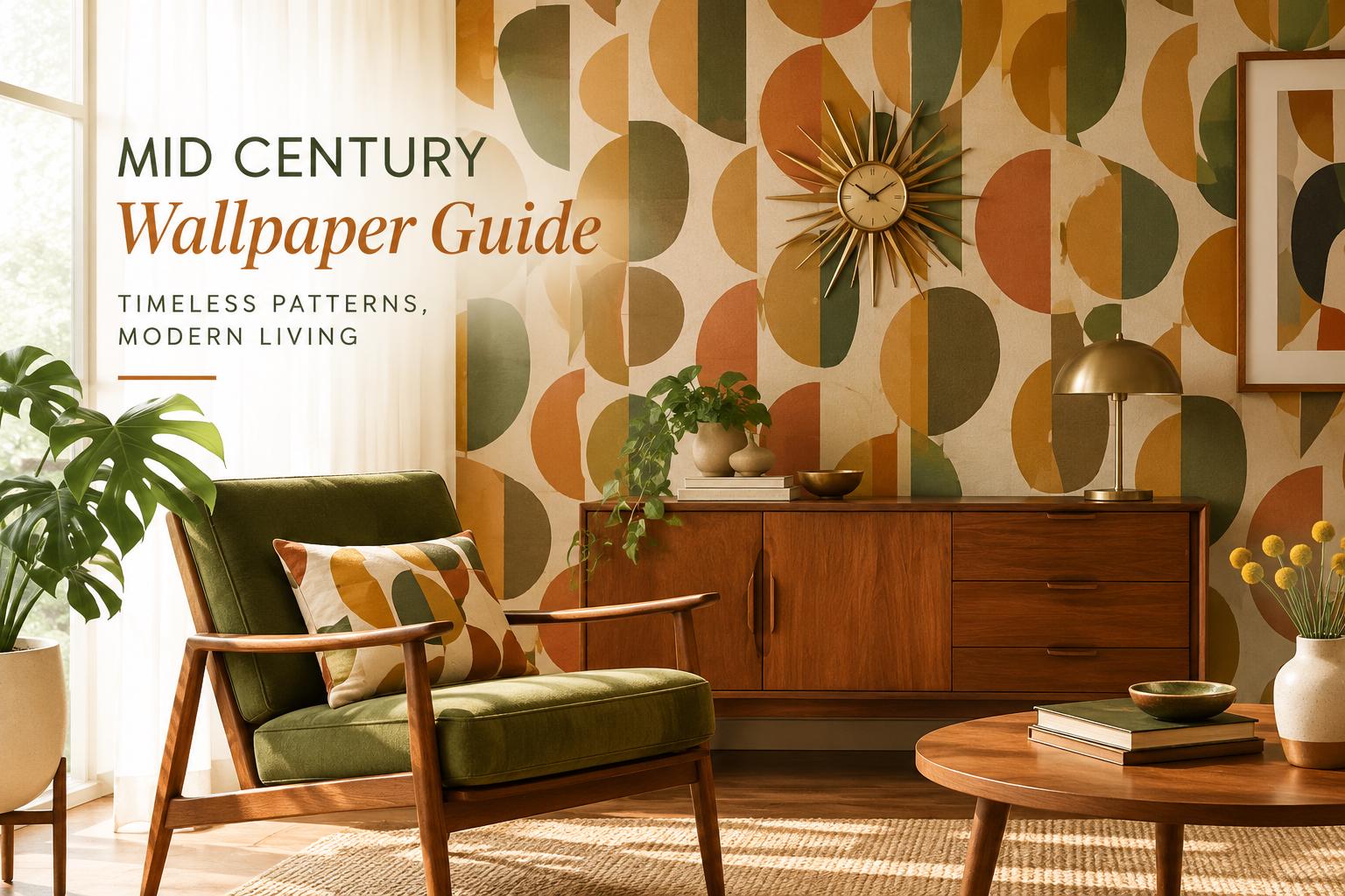
A great mid century wallpaper guide starts with a simple truth: the style is not about making a room look frozen in 1962. It is about borrowing the era’s confidence with color, geometry, and playful organic forms, then making it work for the way you live now. A single accent wall can give a quiet bedroom more character, make a home office feel intentional, or turn a plain rental dining nook into a space people remember.Mid-century design feels polished because it balances opposites. Clean lines sit beside curved shapes. Warm woods meet optimistic color. Graphic patterns feel lively, but the room itself still has breathing room. Wallpaper is one of the easiest ways to bring that balance home without replacing furniture or committing to a major renovation.
What Defines Mid-Century Wallpaper?
Mid-century wallpaper draws from the design language popular from roughly the late 1940s through the 1960s. Think atomic starbursts, boomerangs, arches, stylized leaves, abstract florals, and orderly geometric repeats. Some prints lean bright and playful; others use a quieter palette of oat, olive, rust, charcoal, and cream.The best choice depends on the mood you want, not on whether every detail is historically exact. A bold atomic print can bring energy to a bar area or powder room. An abstract botanical in muted green and tan can feel more relaxed in a bedroom. If your home already has warm walnut furniture, tapered legs, or vintage-inspired lighting, a mid-century pattern can pull those pieces together. If it does not, wallpaper can become the room’s first and strongest style cue.There is a difference between mid-century modern and retro kitsch, although both can be fun. Mid-century modern usually favors edited palettes, clean shapes, and generous negative space. Retro-inspired decor can be more saturated, more whimsical, and more maximal. Neither approach is wrong. The key is choosing how much visual energy the room can hold.
Choose a Pattern That Fits the Room
Before falling for a print on a screen, look at the room’s proportions, natural light, and existing furnishings. Wallpaper has more visual presence than paint, especially when it includes a repeated motif. Pattern scale matters as much as pattern style.
Small rooms can handle personality
A compact powder room, entryway, or laundry area is often the ideal place for a punchy mid-century print. Because you spend less time in these spaces, you can be bolder with contrast, color, and movement. A rich teal ground with cream starbursts or a warm orange geometric can make a small room feel designed rather than overlooked.Do not assume a small room requires a tiny pattern. Large-scale motifs can work beautifully in tight spaces because they read as intentional and avoid a busy, fussy look. The trade-off is that an oversized, high-contrast print may feel dramatic on all four walls. If that feels like too much, use it on the wall behind a mirror, vanity, or console instead.
Living rooms and bedrooms need balance
In a larger room, wallpaper can define a focal wall behind a sofa, bed, or dining banquette. Choose a pattern whose colors echo something already present, such as a rust throw pillow, olive velvet chair, black metal lamp, or oak sideboard. This gives even a lively print a settled, collected feel.For bedrooms, look for rounded shapes, softly layered botanicals, or low-contrast geometrics that add interest without competing with rest. In living rooms, stronger repeat patterns can work well if the upholstery is mostly solid. When your sofa, rug, and drapery already include several patterns, a more restrained wallpaper will usually create the better result.
Home offices benefit from a clear backdrop
A mid-century accent wall behind a desk can make video calls look more polished and make a practical work zone feel more personal. Avoid extremely tight, high-contrast repeats directly behind a monitor if you are sensitive to visual distraction. A broad abstract pattern, arch motif, or muted botanical brings dimension while keeping the workspace calm.
Build a Palette Around Warmth and Contrast
Classic mid-century color stories often combine warm and cool tones. Mustard pairs easily with deep blue. Olive works with rust, blush, black, and walnut. Terracotta feels grounded beside cream, charcoal, or pale aqua. You do not need to use every recognizable retro color at once.Start with the undertones already in the room. Floors and wood furniture are especially helpful guides. Golden oak, walnut, and teak sit naturally with ochre, moss, burnt orange, and warm neutrals. Gray flooring or black-framed windows can support cooler greens, cobalt, soft pink, and crisp ivory.A wallpaper background color has the biggest effect on the room’s overall mood. Light grounds feel airy and make architectural details stand out. Dark grounds create depth and can make a wall feel more architectural, especially behind a bed or dining table. In spaces with limited natural light, dark wallpaper can still be striking, but add layered lighting so the pattern does not disappear at night.Ordering a sample is the practical step that protects a design decision. View it on the intended wall in morning light, afternoon light, and with your lamps on. Compare it with flooring, fabrics, and trim. Screen colors are useful for browsing, but your room’s light is the real test.
Mid Century Wallpaper Guide: Accent Wall or Full Room?
An accent wall is the easiest starting point when you want a high-impact update with a lower commitment. Choose the wall that naturally receives attention: behind the bed, sofa, desk, dining table, or entry console. The pattern will feel purposeful because it has a visual job to do.A full-room installation can be equally beautiful, particularly in a powder room, nursery, breakfast nook, or enclosed office. It works best when the wallpaper has enough open background space or a softer contrast level. In a large open living area, wrapping every wall in a bold print may compete with adjacent rooms. In that case, one featured wall often delivers more style with less visual noise.Consider what happens at corners and around doors, too. A graphic repeat looks especially satisfying when it flows around a room, but a feature wall simplifies the project if you are new to wallpaper. There is no rule that says a design must cover every wall to make an impact.
Pair the Wallpaper With the Right Furniture
Mid-century wallpaper does not require a museum-perfect set of vintage furniture. A few complementary elements are enough. Warm wood, slender legs, rounded mirrors, ceramic table lamps, cane details, and simple brass accents all work naturally with the style.Keep the large pieces calm if the wallpaper is expressive. A cream, camel, olive, or charcoal sofa gives a bold geometric print room to shine. If your wallpaper is subtle, you can introduce personality through a sculptural light fixture, curved accent chair, patterned rug, or colorful art.Be mindful of competing curves and lines. A wallpaper filled with arches pairs nicely with straight-lined cabinetry or a rectangular sofa. A sharp geometric can soften next to a round mirror, globe lamp, or curved headboard. That contrast is what makes a mid-century-inspired room feel considered rather than themed.
Plan for Peel-and-Stick Success
Peel-and-stick wallpaper makes a visual refresh more approachable, but the wall surface still matters. It is designed for smooth, clean, dry walls. Freshly painted walls should be fully cured before installation, and heavily textured surfaces, flaking paint, or dusty walls can interfere with adhesion.Measure each wall at its widest and tallest points, including areas above doors or around built-ins when they will be covered. For made-to-order wallpaper, accurate measurements are essential because the design is produced for your space. Double-check numbers before placing an order, and add a little allowance for trimming at the top and bottom.Installation is easier with a second person, especially for tall panels. Start with a straight first panel, work slowly, and smooth from the center outward as you remove the backing. Rushing is where bubbles, crooked seams, and frustration usually begin. A clean work surface, a smoothing tool, and sharp trimming blade make a noticeable difference.Because made-to-order wallcoverings are created specifically for your selected dimensions, confirm your measurements, pattern choice, and color direction before purchasing. A sample can help you feel confident before the full order is produced, particularly for a large wall or a room with tricky lighting.
Use the Style Where It Feels Most Personal
Mid-century wallpaper is especially effective in rooms that deserve a little identity. A nursery can take on a refined, playful feel with soft sunbursts or abstract florals. A guest room can feel thoughtfully finished with warm geometric shapes behind the bed. A vacation rental can gain the memorable feature wall that makes listing photos stand out without remodeling the entire space.WallpaperCraftWorks designs are made to order and can be sized for your wall, which helps turn a favorite pattern into a more tailored design choice instead of a one-size-fits-all roll. For renters, removable self-adhesive wallpaper offers an appealing path to personal style, provided the wall is smooth and the property’s rules allow it.The most successful mid-century room is not the one with the most orange or the most atomic motifs. It is the one that feels like your home, with a little more rhythm, warmth, and confidence every time you walk in.